

6 Simple Reasons Why You Need a Mobile Friendly Website

Once upon a time, in the not too distant past, websites were accessed only from a desktop computer.
Then, things started shifting towards laptops because they were portable.
Now, just about everyone is walking around with a ‘tiny’ computer in their pocket in the form of a smartphone where they can access the internet pretty much anywhere they go.
So the question is, has your business or blog site been able to keep up with all these changes?
If not, here are a few reasons why it is essential to implement mobile-friendly, responsive website design first.
What Is Responsive Web Design?
I’m sure that if you are one of the many, many smartphone-wielding people walking the planet today, you have had the distinct ‘pleasure’ of accessing a website via your smartphone only to be frustrated cause you had to jump through hoops just to see the darn page?
You may even have had to scroll continuously from left to right just to be able to read one sentence.
Maybe you turned your phone sideways to get that sentence to fit in one screen or to make the text a readable size.
Or you kept ‘pinching and zooming’ with your fingers to resize the image or text to see all the details. It’s frustrating to be sure.
What Does it Mean to Have a Responsive Web Design?
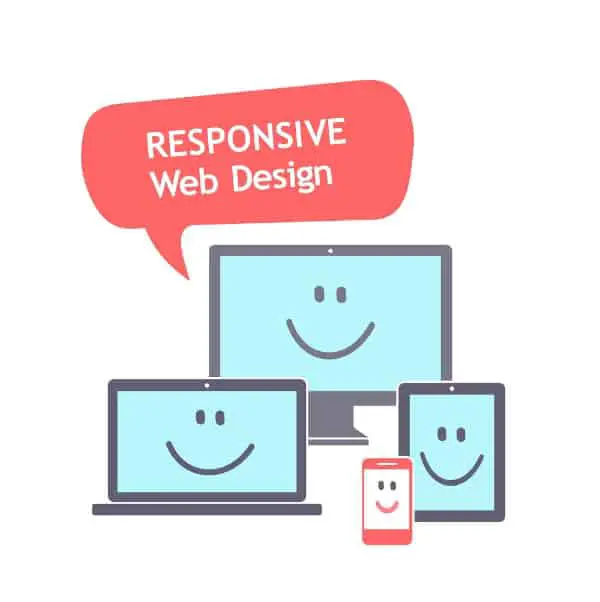
Responsive web design (RWD) is an approach to web design that makes web pages render well on a variety of devices and screen sizes—with one URL and one content source.
Believe it or not, in the not so distant past, developers used to build more than one site in order to accommodate different screen sizes. Imagine having to do that now with the number of device types out there on the market today.
This seems totally inefficient…right?
What makes a Mobile Friendly Website?
Responsive Web Design (or mobile-friendly) is about using HTML and CSS to automatically resize, hide, shrink, or enlarge, a website, to make it look good on all devices (desktops, tablets, and phones).
W3Schools.com
A responsive website has a flexible and fluid layout which adjusts according to screen size, even small screens.
Basically, it is a fancy way of saying that no matter what size device you use to view a website it will still look good.
Whether a small screen smartphone, large smartphone, tablet, laptop, desktop computer, or a huge smart TV, each person sees the page in an optimized way for the device they are using.
Sounds great, doesn’t it. So, why aren’t all websites using responsive design already?
How Important Is Responsive Web Design Today?
Updating your website with mobile-friendly, responsive design tools right now will have several positive effects.
1. More responsive means higher conversion rates
We are a world in motion. People are not stationary in today’s world, and neither are their devices.
A busy mom who wants to check out a product on your website to compare a price with something they see in the store wants an immediate response.
A mobile-ready site allows shoppers to click fewer buttons and order a lower-cost product you offer rather than paying more in a brick-and-mortar store.
2. Improved user experience
Mobile-friendly, responsive design says to today’s busy user that you want to make their life easier and that you are catering to their needs.
For someone who uses a mobile device 90 percent of the time, this is huge. They can view any version of your website with a responsive design.
They can book a hotel, make dinner reservations, set up appointments, and even buy products, all from their smartphone using websites that have implemented mobile-friendly responsive design strategies.
To keep the mobile user around, having a responsive and mobile friendly website is crucial.
When your users feel valued and when they have a great user experience, they tend to come back.
3. Keep the user’s attention
In today’s digital age of instant gratification, people now have a shorter attention span than a common goldfish.
Sad but true.
An essential aspect of mobile-friendly, responsive website design is that it loads quickly.

You can’t afford to have a website today that takes too long to load. Potential customers will click off your page in half a heartbeat.
In fact, more than half of mobile web visitors will leave your site if it takes more than 3 seconds to load.
4. Less work for you
Using mobile-friendly, responsive design, in the beginning, allows you to focus on the more critical aspects of your site and deliver that to users on all platforms, regardless of device size.
Then from there, it is easier to add more content for larger device sizes.
5. Better search engine rankings
Mobile-friendly, responsive design makes Google happy (and we all know the importance of making the Google gods happy).
It is the same website but now optimized for viewing with different sized devices. Having a single site makes it easier for you and for the search bots rather than utilizing a separate mobile site.
6. Flexibility & Better Browsing Experience
Your website can adjust to several device sizes for viewing. You can adjust which content to be seen on each device size so as to add value to the user experience.
The content will expand or resize according to the space allocated on each device, with the main design and content remaining constant across all devices for a seamless user experience.
Is your website still designed only for large desktop computers? It may be time to make the jump and move to mobile-friendly, responsive design.
Don’t risk losing a huge chunk of potential customers. Make sure you have a mobile-friendly website that is responsive and do it today!

If you are ready and want to get started building your website or blog today, check out how to start a blog on WordPress to get up and running in less than an hour.


Very informative information, thanks so much for the reminders!